Through the Lens
INTERACTIVE EXOPLANET SCROLLYTELLING • D3.JS
Through the Lens: An Interactive History of Exoplanet Discovery
Role: Frontend Developer & UI Designer (Data Processing, Scrollytelling Logic, D3.js Integration)
Stack: HTML5, JavaScript (ES6+), D3.js (v7), Scrollama, Vite, Vanilla CSS
Dataset: Open Exoplanet Catalogue (filtered 1992–2017)
Through the Lens lets visitors follow exoplanet discoveries from 1992 to 2017. A scroll-driven timeline connects each period to interactive charts, making changes in discovery methods, the properties we can measure, and gaps in the catalogue easier to explore.
The design challenge
A catalogue of more than 3,500 planets is difficult to read as one static chart. The story also has two kinds of change: the number of discoveries grew, and the measurements available for each planet varied. A guided timeline introduces the data gradually, while the charts remain interactive for closer inspection.
Key Features
The Telescope Lens
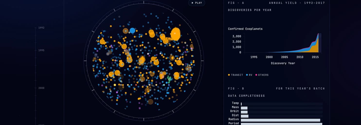
An interactive scatter plot of over 3,500 planets. As the user scrolls, the catalog populates year-by-year in real time.
- Timeline Scrubbing: Fluid scroll-driven transitions.
- Flicker Effect: Planets with missing critical parameters flicker on the screen, representing the "ghosts" of our catalog.
Solar System Zoom
A logarithmic scale reference row of our solar system with a "Zoom to Earth" button.
- Scale context: Gives visitors a familiar comparison for planets plotted at much larger scales.
Yield & Completeness
A dual-chart dashboard showing discoveries per year and parameter completeness.
- Figure A: Cumulative stacked area chart of discovery methods (Transit, Radial Velocity, etc.).
- Figure B: Bar chart tracking data fill rates for the selected year.
Scientific Storytelling Panels
Three guided panels focus the scatter plot on specific scientific questions:
- Panel 01 (Hot Jupiters): Highlights a subset of giant planets and invites visitors to consider how discovery methods shape the observed sample.
- Panel 02 (Habitability): Compares stellar temperature and orbital period while showing the limits of using those measures alone to discuss habitability.
- Panel 03 (Eccentricity): Visualizes the orbital shapes and eccentricity, highlighting the extreme diversity of planetary orbits compared to our own solar system.
Design & Technical Implementation
The dark visual treatment gives dense data points room to stand out, while consistent colours help readers follow discovery methods across views.
Scrollama connects narrative steps to the selected year. The main application parses the catalogue in the browser and coordinates updates across focused D3.js chart modules, so the scatter plot, discovery yield, and completeness views tell the same story as the timeline moves. The layout also adapts the visualizations and reading panels to smaller screens.