Data Visualization
// RECIPE & PANTRY OPTIMIZER
Recipe & Pantry Optimizer: An Interactive Data Visualization Tool
Team: I worked on this project in collaboration with colleagues.
Domain: Pantry staples, flavor pairings, and cooking process management
This interactive data visualization system transforms a dataset of over 62,000 recipes into an exploratory, user-friendly tool for home cooks. The dashboard is designed to help users optimize their kitchen management, improvise with available ingredients, and efficiently manage their time during meal preparation. By combining relational data with temporal process tracking, the platform supports a seamless user journey from culinary inspiration to execution.
The Challenge
While traditional recipes provide standard, step-by-step instructions, they often fall short in helping cooks visualize the bigger picture. Users frequently struggle to:
- Understand how different ingredients pair together to create their own custom recipes.
- Distinguish between active effort and passive waiting time during cooking.
- Easily assess a recipe's complexity, workload distribution, and total duration before committing to it.
The Solution
To address these needs, we designed a unified dashboard featuring two integrated views that bridge the gap between ideation and preparation.
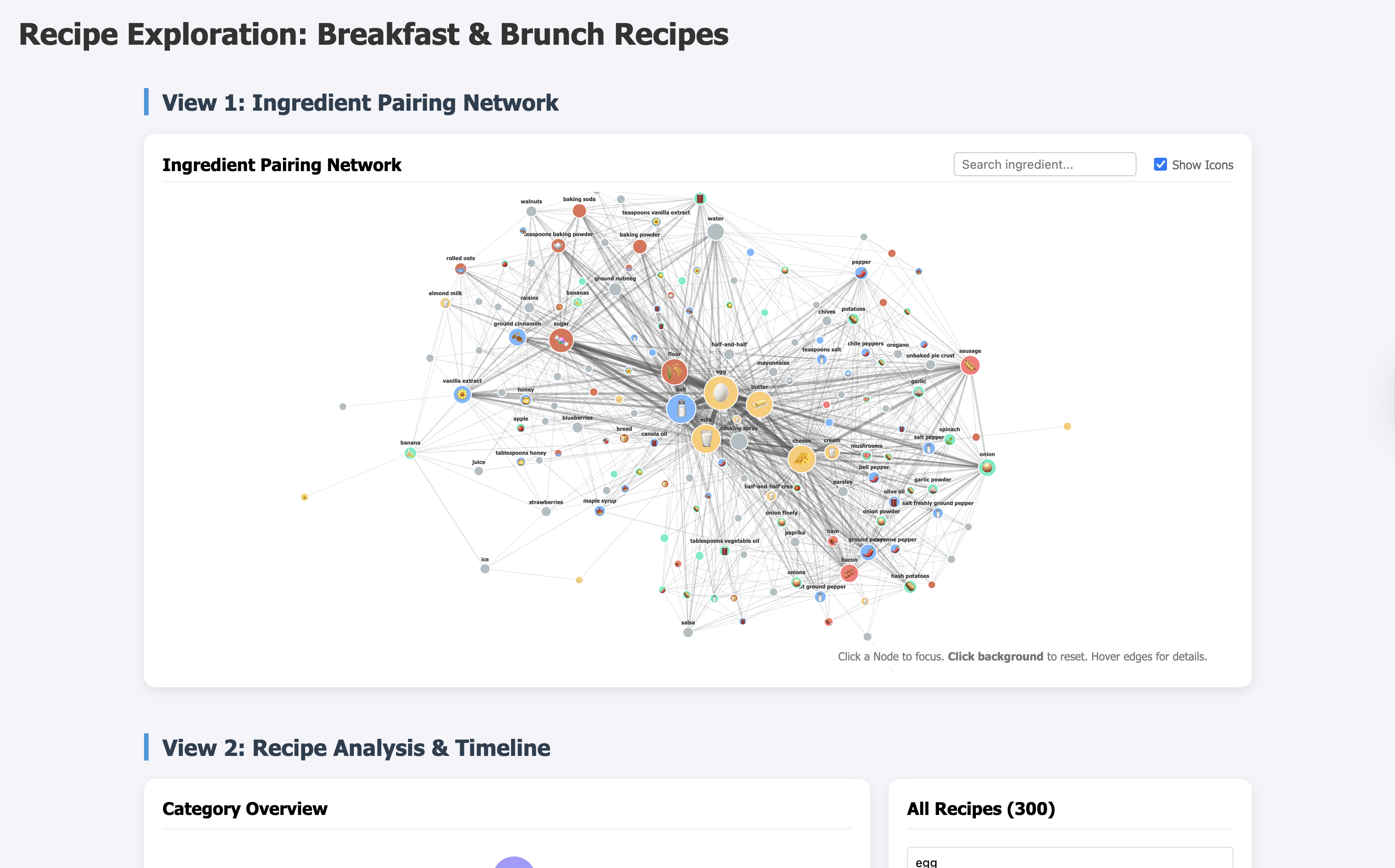
1. Ingredient Pairing Network (Exploration & Ideation)
An interactive, force-directed node-link graph that reveals co-occurrence relationships between ingredients.
- Visual Hierarchy: Larger nodes represent highly popular ingredients, while the thickness of connecting lines immediately highlights the strength of the pairings.
- Intuitive Interactivity: Users can hover for precise details, select specific nodes to isolate direct connections, and toggle optional icons on or off to reduce reading effort and support faster recognition.
- Sync Mechanism: Clicking an ingredient in the network (e.g., "blueberries") automatically populates the recipe dashboard, streamlining the transition from pantry exploration to meal selection.
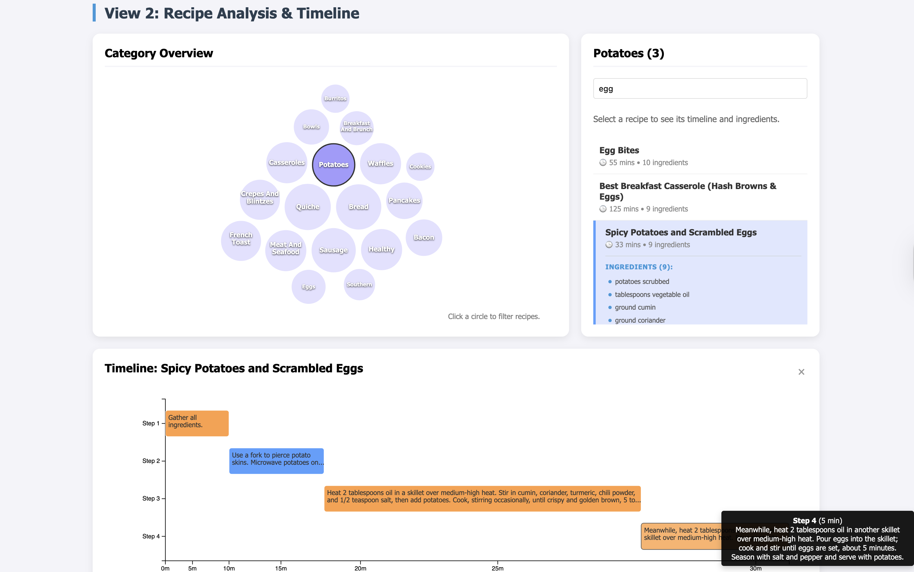
2. Recipe Selection & Temporal Gantt Chart (Execution)
A categorical filtering dashboard paired with a dynamic Gantt chart to model the sequence of cooking steps over time.
- Workflow Management: The horizontal timeline maps out each cooking step, using high-contrast color coding to separate active preparation (orange) from passive cooking time (blue).
- Fisheye Scale Distortion: We implemented a custom D3 Fisheye Scale that acts as a magnifying glass. As users move their cursor across the timeline, the focused area dynamically expands while compressing the remaining segments, allowing for fine-grained reading without losing temporal orientation of the total recipe time.
Design Rationale & Accessibility
Because our target users are everyday home cooks rather than data experts, ensuring an accessible, low-friction experience was paramount. We intentionally minimized the use of excessive colors and decorative elements to reduce cognitive overload and maintain a clear visual hierarchy. The minimalistic layout, combined with high-contrast semantic colors and progressive disclosure (showing deep details only on hover), ensures that the interface remains clean, intuitive, and focused purely on task execution.